Timelines, video screen capturing, live chats and more

A bunch of cool stuff has happened since my last blog, so this will be a bit scatterbrained.

First off, The Tribune made a major improvement to its photo viewer, which has been extremely successful by early indications. I made a video to show readers all the new features:

Whereas past videos I’ve done have been shot with an HD digital video camera and edited on Final Cut Pro X, this one required a different approach. Shooting a video screen of any type is likely to lead to blotches of pixels showing up in your video, which is distracting to say the least. I looked at several free options for screen capture software and came across screencast-o-matic.com.

While the name is horrible, the software is not. The free version lets you save up to 15 minutes of video per clip, which of course it watermarks with a logo in the corner. But get this, the pro version is only $12 for a year! No watermark, no limit. You can video capture your screen quickly and easily from a web-based client (meaning multiple people at the paper can use the same $12 account) and save directly to a variety of places, including YouTube, or to a file on your desktop.

I also used this software to convert a proprietary video for close-circuit TV to a universal format. I just set the screen capture tool to the size of the video as it played on the screen and then saved it out to a file on my desktop. That’s useful for police or jail videos that may be based on older systems.

Next, we’ve done a few live chats lately. We’ve done them before with various technologies, and varying degrees of success. One was a Twitter-based live chat about home-schooling and polygamous communities. It was pretty successful, and the two reporters who worked on the story both answered questions in a text-only Twitter chat for more than an hour.

Then I did a video chat regarding comments moderation on sltrib.com. This one was using Ustream for video and CoverItLive for the text portion. That worked well, although we learned that when you set up CoverItLive you have to set “guest comments allowed” before you go live, otherwise it won’t allow them later. So that chat I think could have been more successful had we not boxed out people who didn’t want to sign in using Twitter or Facebook. We have since done several of these chats with our Jazz beat reporter, who has done a fantastic job with them. The beauty of the video chat vs. a text chat is you can convey so much more over video than you ever could in text. Brian Smith can really crack open his wealth of knowledge when he can freely speak, whereas if he had to type all of it he would only get through two questions in an hour. The question by text / answer by video format is, for me, the smartest use of the medium.

The third option, and one I think has a lot of promise for other applications, is Spreecast. I was the producer for a Spreecast chat with Kim McDaniel of @sltrib, Trey Fitz-Gerald of @RealSaltLake and Tauni Everett of @RideUTA. Spreecast allows you to have multiple video participants appear on screen at the same time. You can have up to four people appear on camera at a time (and who appears is determined by the producer), and it also includes text chat for viewers, the ability to pop questions up on the video screen for participants and speakers to see, and a chance for viewers who want to appear on camera to do so. The chats are automatically archived (though you can tell it not to show up for anyone) so they can be seen later. There’s a whole host of great ways you can use this technology, and all that’s required for speakers is a webcam and maybe some earbuds. You can bring together speakers from different areas easily into one seamless chat. Really, really cool. (Note: This is Flash-based, which knocks out iPad and iPhone viewers, and we tried to add someone from a mobile phone connection, and that just wasn’t happening. However, Ustream has a great mobile app for embedding video from the field.)

Another feature we’ve always wanted was a good interactive timeline builder. I’ve looked at dozens of them online, and the best one I could find was Dipity. But to really use Dipity hard-core was expensive, and it can be buggy. Plus, it’s not like interactive timelines are necessary for every story. They’re really a big-project sort of item, and not something we would use more than a handful of times a year. So paying hundreds of dollars for a relatively little-used, online-only feature is a tough sell. Enter Verite.

This timeline is way better than the vast majority of tools I had found, and comes pretty close to Dipity for overall elegance. It’s still in its infant stages, I believe, but it works great and IT’S FREE. There’s a little bit that has to happen on the back end of your site if you want to host your own timelines, but we’ve managed to get it up and working with little trouble. The whole timeline is built in a Google Spreadsheet with a specific format, then you publish the Google Doc to the web and plug in the ID. You can use the embed generator if you don’t care about hosting the timelines yourself.

These tools are way cool, way useful and way cheap or better. I can’t wait to start getting more out of them in the very near future.

Why crowdsourcing won’t save journalism

Many big-thinkers in journalism rightly point out the traditional media are no longer gatekeepers of information. We no longer have a stranglehold on the pipeline. We are but one cog in the machine, albeit still a much bigger cog than many people realize.

With so much of the population constantly plugged in and able to report what’s happening around them, many of those big-thinkers say some day soon we will “harness the power of the crowd” to report the news.

After all, what could be better than mounds of free, timely information supplied by eyewitnesses from every corner of the globe?

How about accurate information.

Some colleagues and I recently took on a pretty cool project, testing the cellular data networks around Salt Lake City and creating a few maps to show the results. Despite technical issues with getting the data to display how we wanted, I think the results were great. We also asked readers to pick up where we left off, by testing the mobile network speeds on their own and entering the results into a form that we would turn into an online map.

It’s only been up about 24 hours at this point, but I’m pleased to have gotten 26 reader responses plotted. I didn’t expect it to go crazy, but I wasn’t sure it would even be this successful. But those responses also lay bare the biggest problem with crowdsourcing: You can’t trust it.

The instructions are explicit. I tell readers the exact format to enter dates, addresses and the speed readings they got in kilobits per second. About 70 percent of people did it right. The others gave me an address but no city and state; some gave readings in megabits per second instead of kilobits (despite the word being in capital letters); one person neglected to put numbers in the speed fields, instead writing “kbps”; and a few clearly had wifi connections when they ran the speed test, reporting numbers so far out of the realm of a 3G connection that I should delete them, although I won’t. I did convert the ones that were sent in Mbps to Kbps for consistency, and I did add in city and state when those were missing. I deleted the ones where the information was completely wrong. In other words, I did some basic editing.

Do I consider this experiment a failure? Absolutely not. In fact, I’d say it’s a mild success. We engaged readers and asked them to contribute to our body of facts. But had I asked the crowd to do all of my research instead of having a technology reporter hit the streets and run the readings, I would have ended up with a story that wouldn’t meet my paper’s standards. Perhaps 70 percent or more of it could have been wrong, and frankly I can’t vouch for the numbers we got that do look accurate.

This was a very simple assignment. Download an app, push a button to run the test, send the results in a specific format. If an editor can’t trust the information that comes in with something that basic, why should he or she trust the crowd with anything more serious?

Smartphone apps every news reporter should have and how to use them

You’re in the field. News is happening. Your editor wants a story, pictures and video stat, and your Twitter followers are waiting for the latest update. Keeping up with today’s news demands can be a challenge, but there are several ways news gatherers can stay ahead of the game.

To be effective in the field, you have to have the right tools and the knowledge of how to use them. Here are my tips on which apps reporters should have and how to use them effectively. Several of these are built in to the phone. I run Android, as do most reporters in my newsroom, but my suggestions should all have iPhone counterparts.

The first thing I recommend is having a “reporting home screen.” Smartphones usually have several pages of screens where users can drop widgets, icons and folders. You should consolidate all of your basic reporting tools into one screen (or folder) so you won’t be searching through a mass of applications in the heat of the moment. My reporting home screen is one swipe to the left of my main screen. Here’s what it looks like (killer Bruce Buffer background optional):

At the tippity-top is a Google search bar for quickly searching the Web (complete with voice-recognition option).

Obviously, the first two icons are shortcuts to my phone’s camera and video functions. Sure, you get to them essentially through the same app, but I want to quickly go to the function I need when news is happening, which is why I have a shortcut for each option.

Next I have the maps function, which is handy for finding out where you are or where something else is. This works in conjunction with both the GPS toggler — which turns your battery-sucking GPS function on and off — and Navigation — which is the turn-by-turn direction feature built in to most smartphones. A neat feature you may not be aware of: On Google Maps you can send a map to someone’s phone directly. This is useful if you are an editor sending a reporter to a breaking story because you can share the exact address via Google Maps. The reporter gets a text message with a hyperlink to the address, which opens in Maps. They can then activate turn-by-turn directions and be on their way.

Plume is my Twitter client. I use AIM for private messages with other reporters or editors, though you could use text messaging for that, too. Next up is Google Translate, which is a semi-useful real-time translation app I’ve covered previously. There’s also a voice recorder for sound bites or interviews. Ustream is my preferred live-streaming app and has the added bonus of allowing you to save your live-stream video for later embedding on your site.

Scanner Radio offers access to streaming police scanner traffic from around the world. It uses the same scanner feeds as RadioReference.com, so check those to see how well covered your particular area is on that front. This can be really helpful to listen to if you’re trying to find out what’s going on during a breaking crime story or public emergency.

The last slot on my reporting home screen is Dropbox, a file-sharing service that allows you to move files between your phone and desktop or laptop computer, as well as allows you to share file space with others in your office.

These are by no means all of the apps you will use as a reporter. Many people swear by Evernote, and that’s definitely one to check out as it allows you to access a lot of information between your phone and computer, among other cool things. You could use Evernote to store a copy of your source list so that you’re never without it.

You could also have a folder with bookmarks to websites you may use frequently for your job.

The key is to practice using the apps. Shooting video is no good if you can’t get it to your readers, and installing Ustream is pointless unless you’ve already set up an account to go live immediately and have a plan in place for getting the stream’s embed somewhere on your site when news breaks.

I suggest running the following drills to ensure you’re ready when the moment strikes.

1. The House Fire: Take a usable photo, send a tweet and upload a 20- to 30-second video within about five minutes (data speeds will affect your timing). This is a pretty good possibility for any news situation. If you can take a photo (and either email it to your editor or photo desk / or post it to Twitter), tell your readers what’s happening and then upload a short video to YouTube, you’ve covered a lot of bases quickly. While the video is uploading, you can put on a traditional newsgathering hat and start tracking down more information. Again, key here is having your YouTube account information saved already so that you can quickly upload and someone on your web team or your editor can get that video in front of your readers.

2. OMG!: Sometimes you’re just minding your own business and all of a sudden you notice something serious is about to go down. Maybe a fight is about to break out among City Council members. Perhaps some sports rivals are getting into a heated exchange. Maybe  supporters are getting out of hand outside a courthouse. Whatever it is, you can sense something newsy is about to happen. Like a Wild West gunman, you grab your phone from your pocket and begin live streaming. You want to get from pocket to streaming in under 20 seconds. (You can set up a private “test” channel for this exercise.)

3. Go! Go! Go!: Have your editor send you directions from Google Maps to your cell phone. Then load that address into your phone’s turn-by-turn directions app.

4. Si. Yes.: Take Google Translate for a spin. Find someone who speaks another language as well as English and try to hold a conversation with them using Translate. The results may not be pretty, but you should know how well it works before you need it for real.

5. For safekeeping: Record audio and upload it to your Dropbox account. Then download it to a computer.

Using Google Refine to easily uncover news stories in data

Google Refine is a powerful tool for spot checking whether a story might exist inside the data you’ve collected. It also might clue you in to another story based on data you already have.

Google refine allows you to both clean up, or normalize, data in a spreadsheet or CSV file and examine it for interesting trends, numbers, outliers, etc. It is unlike a typical spreadsheet program, and can help a reporter make a quick analysis of numbers or data without learning how to manipulate them on a spreadsheet.

You wouldn’t use Refine like you would Excel, to run formulas on existing values or anything like that. Refine is a supplement to that sort of analysis. It’s what you do before you start working with Excel to make sure you’re applying that analysis to the right data instead of what you may have thought was the right data.

Download and install Google Refine here or by searching for it (where else?) on Google.

We’re going to explore Google Refine using a partial file downloaded from Transparent.Utah.Gov. (Note: I have inserted errors into this file for training purposes.) This file contains 10,000 records of expenses filed by Salt Lake City in FY2011. You can download the file here.

When you open Refine, you’ll notice it brings up a web browser window. While it is browser-based, it is not Web-based. You aren’t uploading data somewhere. Refine is just using the browser to run the program. You can also use Refine without an Internet connection.

GETTING STARTED

Open Refine, and click “Create Project” on the left. At the top you’ll see a bunch of file types that Refine works with. In the middle you’ll see several ways you can get data into Refine. We’re going to use a file. So under “Get data from” click “This Computer” and click the “Choose file” button. Find your file and hit “Choose,” then hit “Next.”

What you see here is a preview of how your file will look with the current import settings in Refine. You may need to change things up to make it look right. For instance, there may be blank rows at the top you need to ignore. There may not be column headers. It may be a tab-separated file instead of a comma-separated file. Do whatever you need to do to make the preview start to make sense and click the “Update Preview” button to check your settings. (For this example file, the default settings should be fine.) Once you’ve done that, at the top right you’ll see a spot to give your project a name. Click the “Create Project” button when you’re ready.

NAVIGATING THE DATA

Now you’re looking at your main project screen. This is the spreadsheet you imported. In the large blue bar at the top you’ll see the total number of rows or records in your spreadsheet. Just below that you can select how many rows Refine shows you at once, either 5, 10, 25 or 50, and you can scan through the various pages of data. Choose to see 50 rows.

The wonderful thing about Refine is that it’s very difficult to screw up your data, and even if you do, there’s an unlimited number of undos to get back to the beginning. So don’t worry about contorting the data any way you want — you won’t hurt it.

Let’s dig into this spreadsheet and start testing out Refine’s capabilities.

THE MAIN TOOLS

Google Refine uses Facets and Filters to cut through data in a meaningful way. Using these, you can break a column or several columns down into various components.

Facets look at the contents of a column and group similar items together. Let’s look at a Text Facet on the Payee Name column of the spreadsheet. To get there, click the down arrow inside the “Payee Name” header. You’ll see the main array of Refine tools. Choose the first one, “Facet,” and choose “Text Facet.”

To the left of your table you’ll see the results of that facet.

The dark blue bar tells you which column you’re applying the facet to. The light blue bar shows how many results were found and allows you to sort the results by name (alphabetical) or count (most common to least common).
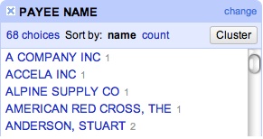
The default sort is by name, and you can see there are 68 choices — or 68 different names listed in the 10,000 rows of data in the Payee Name column. At the bottom of the results there’s a thin blue bar with two lines in it. You can drag that up or down to reveal more or fewer results.

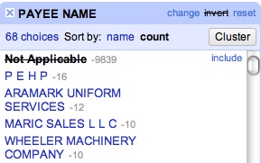
Regardless of how you sort, next to each name you’ll see a number. That number represents the number of times that name appeared in the column you selected. Choose to sort by count. You’ll see that in this table 9,839 “Payee Name” results are “Not Applicable,” followed by several results for actual named entities.

Click on “Aramark Uniform Services.” On the left, that is highlighted, and on the right are all of the results in your spreadsheet that have Aramark Uniform Services listed as the Payee Name.

What if you want to look at all the results except those that have “Not Applicable” listed? Click “Not Applicable” on the left-hand side, and all the “Not Applicable” results show up on the right. On the left, in the blue bar next to “Payee Name” you’ll see the word “invert.” Click that. Now all of the entries except “Not Applicable” appear on the right.
You can also add other facets and filters to the results shown for a compounding effect. Put a text facet on the “DESC” column. You’ll get 53 choices. Choose “City Building Supplies.” Now the records on the right are only showing the ones where the “Payee Name” is something other than “Not Applicable” and where the “DESC” is “City Building Supplies.”

Let’s clear all the facets we currently have applied to the spreadsheet by clicking the X button in the blue bar at the top of each facet on the left-hand side. Now we’re back to seeing all of the data.

Now we’ll look at number facets. Click on the down arrow in the “Amount” column and select “facet,” then “numeric facet.” On the left you’ll see a graph showing you a range of numbers and how many records are in each segment of that range. On the right and left of that graph are two handles to allow you to select only the records in a certain numeric range. Grab the left handle and drag it right until it is just past the big block of records in the middle.

Now you’re looking at only records where the expense was greater than $100,000, with the largest being about $1.7 million. This is an easy way for you to find out the outliers of any spreadsheet — what’s unusual about the data. As a reporter, you may scan the list of Payee Names and wonder why R P Wetlands & Waterfowl LLC got more than $560,000 of Salt Lake City’s money. You might look at the Description field and ask why the city paid more than $5.3 million for City Data Processing Services on the same date.

Clear the numeric facet by clicking the X next to Amount in the blue bar on the left side.

Now click the down arrow in the “Posting Date” column again, choose “Facet” and “Timeline Facet.” On the left, you’ll see a similar graph to what you saw with the numeric facet, but this one is grouping all the items by the date they were filed. This looks less impressive because the data set we’re working with is not the full expense list for Salt Lake City for all of FY2011, it’s only a small subset. In fact, it’s only the expenses posted July 1-9, 2010. However, if we had a full dataset, you would be able to see whether there are certain dates throughout the year that the city consistently pays out more often, or whether it went a stretch without paying bills. You might add a numeric facet for any payment over $100,000 and see where those payments plot on the calendar.

Now for a note about Refine. You may have a column that appears to be dates. However, in spreadsheets, the program doesn’t know that 02-14-2012 or 4/15/03 is a date unless you indicate such, it thinks it’s really just another number or a bunch of text. If you run a timeline facet on what you believe is a date column, and it doesn’t seem to work, you need to tell Refine that the numbers in that column represent a date. To do that, you would click on the down arrow for the “Posting Date” column. Under the “Edit Cells” menu is a “Common Transforms” menu. You would select the “To date” option, and it would convert all those cells into actual dates.

Clear the timeline facet from the left-hand side.

CLUSTERS

Another great feature about Refine is its ability to “normalize” data. Sometimes even data that looks like it’s the same isn’t really, and you need to make it the same by normalizing it so that you can run an accurate analysis.

Run a text facet on the “Org1” column. You’ll see 21 choices. But if you look more closely you’ll see there are some things that don’t look right. For instance, there’s an “Airport” and an “Airort.” It looks like there’s a misspelling in the data. Then there’s a “Fire” and “Fire Department,” which are really the same thing. Refine makes this easy to fix.

There’s a “Cluster” button on the right-hand side of the list of choices. Click that. What comes up is a menu to help you clean the data. Refine combs all the data you have in the column to see whether some of it might represent the same thing. It can do this in two ways. The first method is called “key collision,” which you can see labeled just above the main box on the page.

What Refine is asking here is whether you think these similar items are, in fact, supposed to be the same. In the first instance, it found “Community Development Dept.” and the same phrase with a space at the end. Those should be the same, so click the checkbox under the word “Merge,” then at the very bottom click “Merge Selected & Re-Cluster.”

Now, we’re going to check the other method. Click on the box next to “Method” where it says “Key Collision” and change it to “Nearest Neighbor.” Now Refine brings up an issue with one item where “Department” is misspelled. Check Merge again and click the Re-Cluster button.

Some iterations are more difficult to spot than others, so Refine gives you a few options to make sure your data is squeaky clean. At the top are two numbers, the first one is Radius and the second is Block Chars. Changing these numbers tells Refine to look at your data in more ways to see whether some of it is incorrect.

Change the Block Chars number to 1. You can see the misspelling of “Airport,” which you can now merge. I suggest playing around with changing the numbers in both the Radius and Block Chars, as well as chaining the Distance Function to get a sense of what the different features might do. Can you find which set of features brings to light that there are several rows of “Public Services” that should merge with “Public Services Department”?

When you’re done, click “Close” at the bottom of the screen.

Now you’ve got a shorter list of options in the ORG1 window on the left. Looking down the list you can see that there are still some changes that can be made. For instance, there’s a listing for “Fire” and a listing for “Fire Department.” You can fix those manually. When you hover over the word “Fire,” the words “Edit” and “Include” appear next to it. Select “Edit.” You can now add “Department” and the “Fire” category will merge with the “Fire Department” entries.

Now you’ve properly sorted the data, and there are actually 16 choices instead of the original 21.

Finally, look at the “DESC” column. Notice how some entries are in all capital letters, and some are in lowercase? You can easily make this uniform by clicking the down arrow in the “DESC” column, selecting “Edit Cells,” then “Common Transforms” and then “To titlecase.” This will change the entire column’s entries to titlecase, which is much easier to read. You can do the same to the “Payee Name” column.

EXPORTING

When you’ve massaged the data to where you want it, you can export the file to Excel. Refine will only export the data you have selected. If you want to export the entire data set, clear all of your facets, and click “Export” in the top right corner of Refine. You can export to a variety of file types.

If you have facets applied to narrow the data, when you click export only that portion of the entire data set will be exported. So it’s important to note whether you have facets applied before you export.

Finally, readers will look at your PDFs

PDFs have long been a double-edged sword on our site.

They’re great because you can give readers so much more information without cluttering up your story with a bunch of numbers or names or extraneous details better suited for a sidebar or graphic. But as interesting or useful as that information may be, sticking a link to the PDF file in the story has never panned out traffic-wise. Readers just don’t seem to care enough about the information to click the link (or don’t notice it’s there because they don’t read every word) to get all that goodness.

Now we have a workable solution that won’t completely clutter the story. We’re using Scribd to embed documents inside the story text just like we do videos. The early returns are great. Far more people are reading the material in the few PDFs we’ve embedded than ever did through traditional linking.

So if you’ve got a PDF, text document of nearly any flavor (including those you can’t read because you don’t have the software) or PowerPoint presentation, it can now be shared in a meaningful way. Check with your friendly Web editor for details.

I speak 63 languages, and you can, too

I’ve been playing around with the Google Translate app for my smartphone. It allows you to type or speak into the phone and translate what you said into 62 other languages. I doubt I’ll ever need to converse with someone in Azerbaijani, but should the need arise, I could get by.

At this point, the app works fantastic translating English into other languages. Where it falls short is translating that language back to English. I hope updates will remedy this.

This app really has promise for the reporter out covering a story who needs to communicate who they are and why they’re there with someone who doesn’t speak the same language. Crime reporters often run into this bind. Sure, The Tribune has several bilingual English/Spanish speakers, but if you don’t know you need a Spanish speaker until you’re trying to talk with the main witness, it doesn’t matter who’s on the staff list.

To use the app (which is available for iPhone, as well, though the functionality may differ) you simply tell it which language you’re going to speak and which language you’d like to translate to. Then you type or speak what you’re trying to translate.

Sweet. Not only can I order some Schokolade in German, I can even have my phone say it for me if I’m a little nervous about declaring myself a jelly donut. Click the speaker button next to a word and a robotic lady’s voice does the hard work.

Translating one word is all fine and well, but that’s going to take too long on deadline. See that “Enter Conversation Mode” button at the bottom? Click that and you get something like this:

Yes, we’ve switched from German to Spanish. When in conversation mode, the app switches between the two languages so that each speaker my respond to the other and have it properly translated. As I mentioned, the translating to English is rough to say the least. The English to Russian and Russian to English were actually good. The English to Spanish translation was spot on, but the Spanish to English didn’t even give me something to work with. I found the same with German and Czech. All bilingual speakers say the app’s accent is great and they had no problem understanding what was said. But when they spoke in the other language, the English translation wasn’t even close.

So at this point I wouldn’t try to do a hostage negotiation with Google Translate, but I’d be very comfortable trying to tell someone who I am, why I’m there and how they might be able to help me. Even if their translation to English doesn’t seem to work, you’re at least further along in the process than you would be without the app.

Another beta feature is the ability to write characters for some languages. This has got to be the most painfully slow way to have a conversation, but at least it’s an option. You draw the characters with your finger and it converts it to text. It looks like this:

I would suggest everyone with a smartphone download this app, and then play with it — especially with someone who speaks another language as well as English — before you actually need to use it. You never know when you’ll need to be fluent in Yiddish.

Welcome to I Am Platform Agnostic

By invitation, accident or divine intervention, you have wandered to the blog of Salt Lake Tribune new media content editor Scott Sherman. I talk news. Mostly I’ll be talking about using digital tools to help tell stories.

So what’s with this platform agnostic business? Well, it goes like this: News is and always has been information passed from one person to another. For most of the history of humanity, this has been done by word of mouth, crude drawings, handwritten letters, town criers, smoke signals and the like. When the printing press came along, it gave people a new platform to share news. Same with telephone, radio, television, the Internet and more recently the mobile Internet. You’ll notice I don’t lump those together (more on that in another post).

With all the hand-wringing about how to shift newspapers from print to digital and the necessary complexities therein, many people get stuck on the wrong thing — the platform. Many print journalists have gotten so used to seeing news displayed in one way that they’ve forgotten what we really do.

We deliver news, not newspapers.

Our stock is in information. And the faster we shed the notion that putting ink to paper is the most prestigious and permanent way to deliver information, and the faster we fully embrace all of the platforms available, the more news we tell and the better off we are.

Being platform agnostic means choosing the best venue to tell the story. This digital shift isn’t fundamentally changing what we do. It’s just opening up an immense array of options for doing it.

I type these words on a certain Web site and we call them a blog. If I typed them into my paper’s content management system and pushed the publish button on sltrib.com we’d call them a column. If I said them aloud and recorded an mp3 we’d call it a podcast. If I added pictures it would be a photo slideshow. If I stood in front of a video camera and recited them it would be a standup. These are all platforms with which to share knowledge and ideas. Each has its pros and cons, but journalists should not be opposed to using any of them if it helps them do good journalism.

My goal with this blog is to explore how we share information in every platform. I am not an expert on these platforms. Some of them I’ve never used. And that’s the key. As I learn how to use them, I want to teach others in a way that everyone can understand — a how-to (and when and why) guide for journalists who want to tell their stories in the most effective way possible.